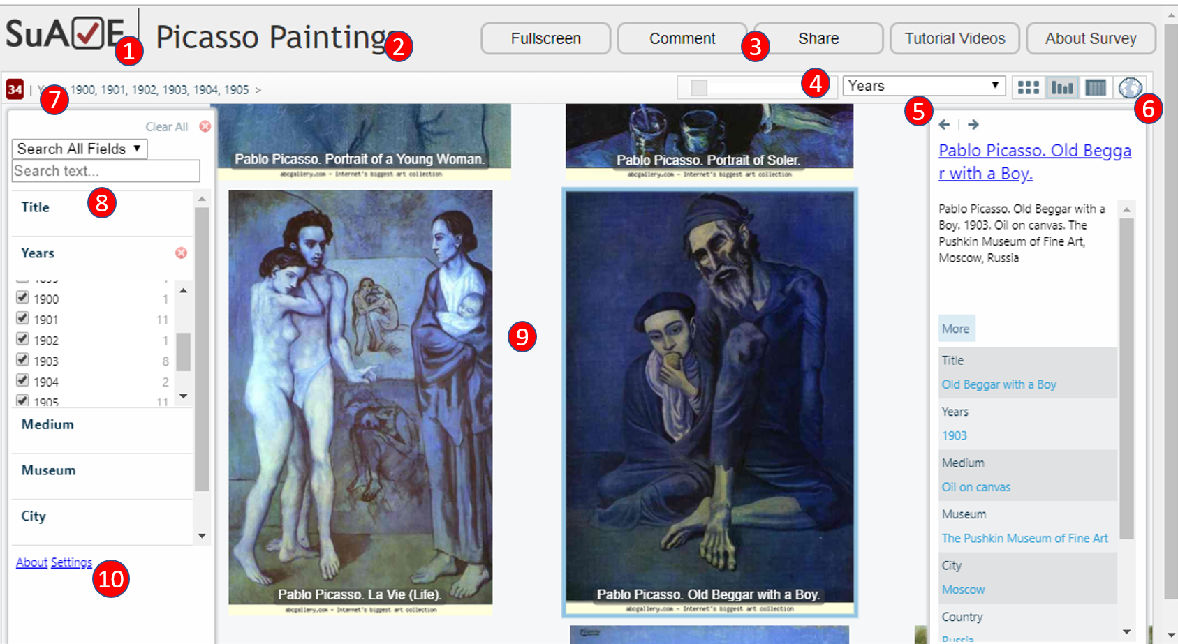
A set of buttons to a) switch to full screen mode, b) annotate a view, c) generate a URL for a given view, d) view user-focused videos, e) view survey metadata as entered by survey publisher
Zoom-in/out slider
Drop-down list of survey variables. This selection determines how items are organized (sorted) in data views
A set of icons for switching between different views and integrations. Here, grid, bucket, cross-tab and map view are available, and the bucket view is currently active
Information about what is currently selected, and how many items are in the selection. Here, paintings from years 1900-05 are in the selection.
Left panel is used to search for variables and text, and to select items to appear in the canvas by using facets. There are different types of facets for multiple-choice/multiple-response, numeric, and date variables. Further, some variables can be only searchable by text but won’t appear in the facets (eg responses to open-ended questions), or will only show up in the information view on the right side.
The main canvas showing selected items. Users can pan and zoom in and out on the items, and make them active (then the right panel will show additional item information).
Additional links to SuAVE project information and Settings (where users can only select a subset of variables to display in SuAVE).